餐饮品牌设计台湾艾朋牛排餐酒馆设计欣赏
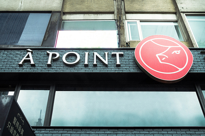
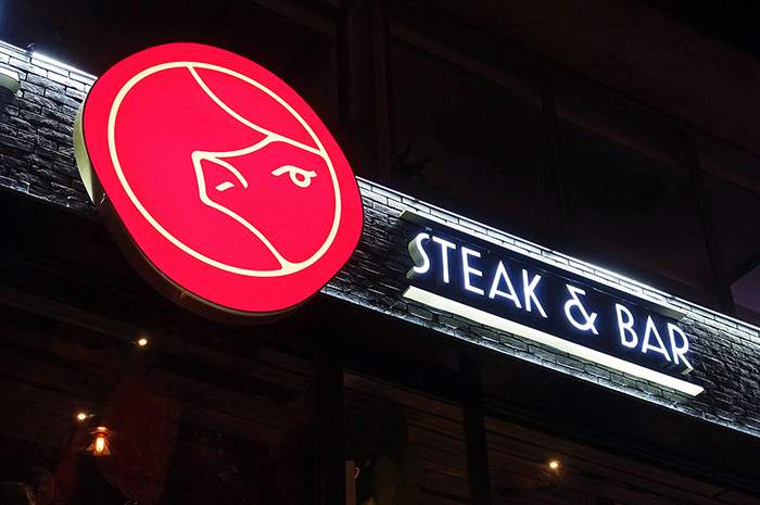
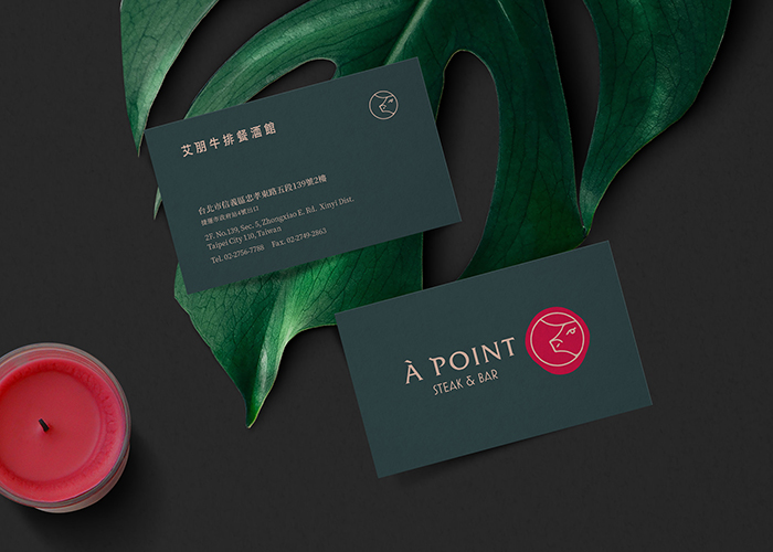
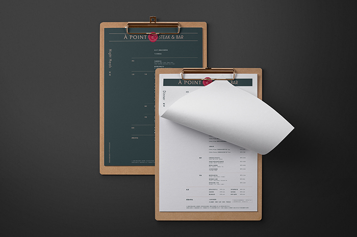
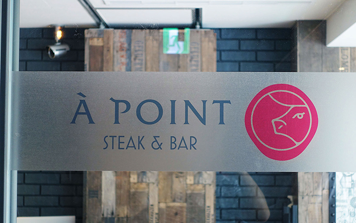
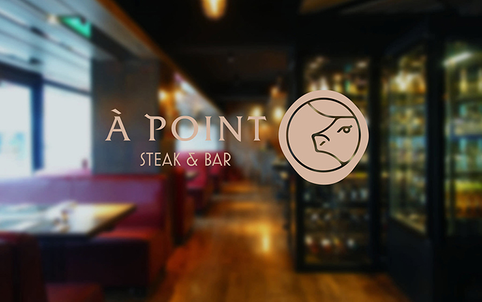
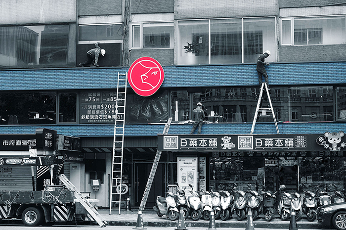
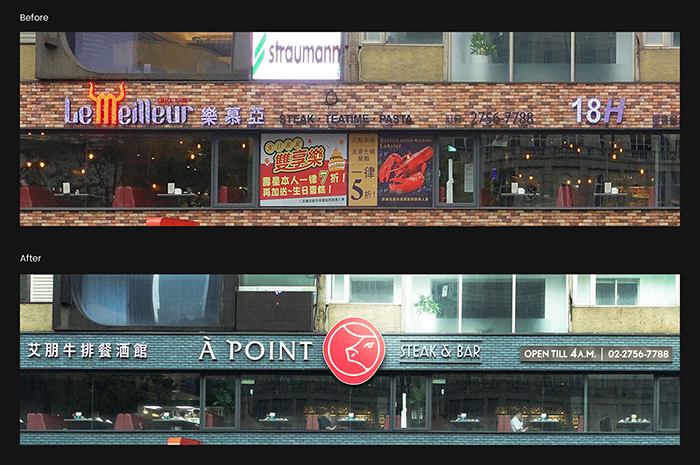
À POINT STEAK & BAR is a renowned restaurant in Taipei. “À POINT” means perfect doneness of a steak in french. The design relaunch of the brand identity centers on the upgrades of new service content and brand positioning. After analyzing the market competitors nearby, we reposition À POINT from family oriented to a premium, fancy steakhouse. The role of the logo is to reflect the ideas of deliciousness, their premium steak, and their wine.

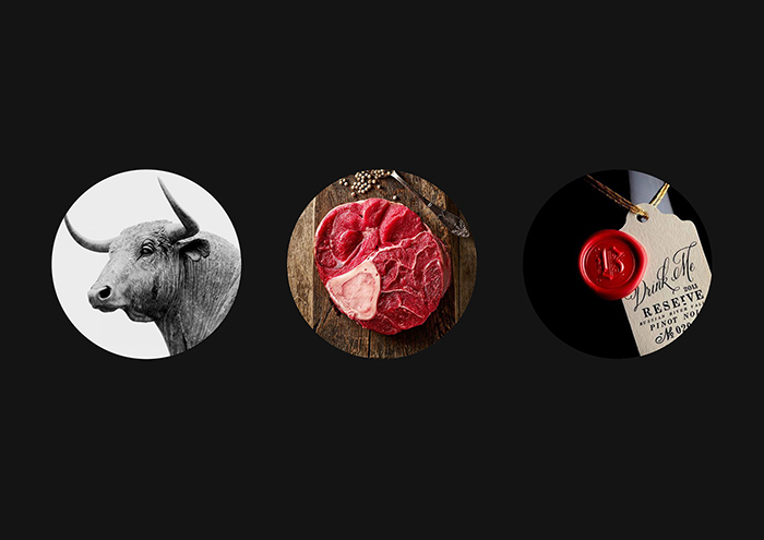
The spirit of the restaurant is mainly displayed by the red organic shape which indicates a cut of steak or a sealed wax of a bottle of wine. A cow illustrated by lines are inspired by the marbling fat texture on the steak. A classy feel is also brought by characteristic logotype both in English and in Chinese.
知名牛排館樂慕亞更名以艾朋牛排餐酒館重新再出發,不僅在菜單的設計與價位上重新做了定位,也期待賦予品牌一個全新的面貌。我們深入探討了艾朋在市場上的定位及餐廳座落區域的特性,重新為其打造具質感且時尚的品牌氛圍。
品牌識別的牛頭造型融入鮮嫩特級牛排的油花,讓人直接聯想餐點的美味 ; 外框簡約俐落的線條,是與紅酒瓶上的封蠟概念的完美結合,忠實呈現牛排餐酒館的精神。
