相关案例
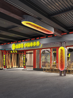
行业:串串香火锅、成都老火锅、重庆火锅
品牌:深圳市食代天香餐饮管理
服务:砂锅串串香全案策划,成都老火锅店空间装饰效果图设计,串串香空间施工图设计,空间软装陈列设计,串串香品牌形象设计,卤串哥品牌故事,串串香品牌营销推广策划。
说明: 餐饮品牌:卤串哥砂锅串串香、成都串串香火锅 项目坐标:深圳坪山坑梓,深圳龙岗老街,深圳龙华观澜老...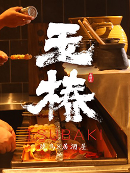
行业:烧鸟居酒屋,特色餐饮,日本料理,主题餐饮
品牌:玉椿烧鸟居酒屋
服务:餐厅全案策划设计,烧鸟品牌命名,日料品牌文化体系构建,日本料理VI设计,空间设计,软装设计
说明: 餐饮品牌:玉椿烧鸟居酒屋 项目坐标:深圳餐饮品牌网红高地——车公庙十亩地 餐饮类型:烧鸟居酒屋...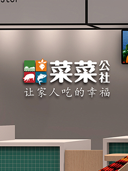
行业:生鲜连锁、生鲜OTO,社区超市
品牌:菜菜公社-金谷园集团生鲜连锁品牌
服务:品牌命名,品牌设计,空间设计,营销策划,品牌全案策划
说明: 菜菜公社生鲜连锁以社区为中心,建立100㎡左右的社区体验生活超市,由金谷园集团统一挑选、加工、包装、...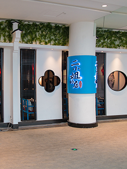
行业:时尚餐饮品牌
品牌:二小姐的店
服务:餐厅市场定位、主题餐厅标志VI系统升级、主题餐厅品牌策划、主题餐厅文化体系升级
说明: 佐阾虹湾购物中心地处深圳梅林片区,梅林路与北环大道交汇处,占地面积 3.23万平方米。佐阾虹湾有机...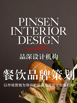
行业:餐饮品牌策划
品牌:品深设计
服务:餐饮品牌策划、餐饮VI系统设计、餐饮品牌手册、餐饮品牌宣传资料
说明: 餐饮品牌策划就是对餐饮品牌文化整合与提炼。就是对餐饮品牌的文化进行立意、策划、规划、设计,就是要站...
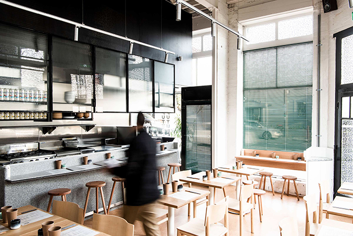
明日之明日日本料理餐厅品牌设计-品深餐饮设计
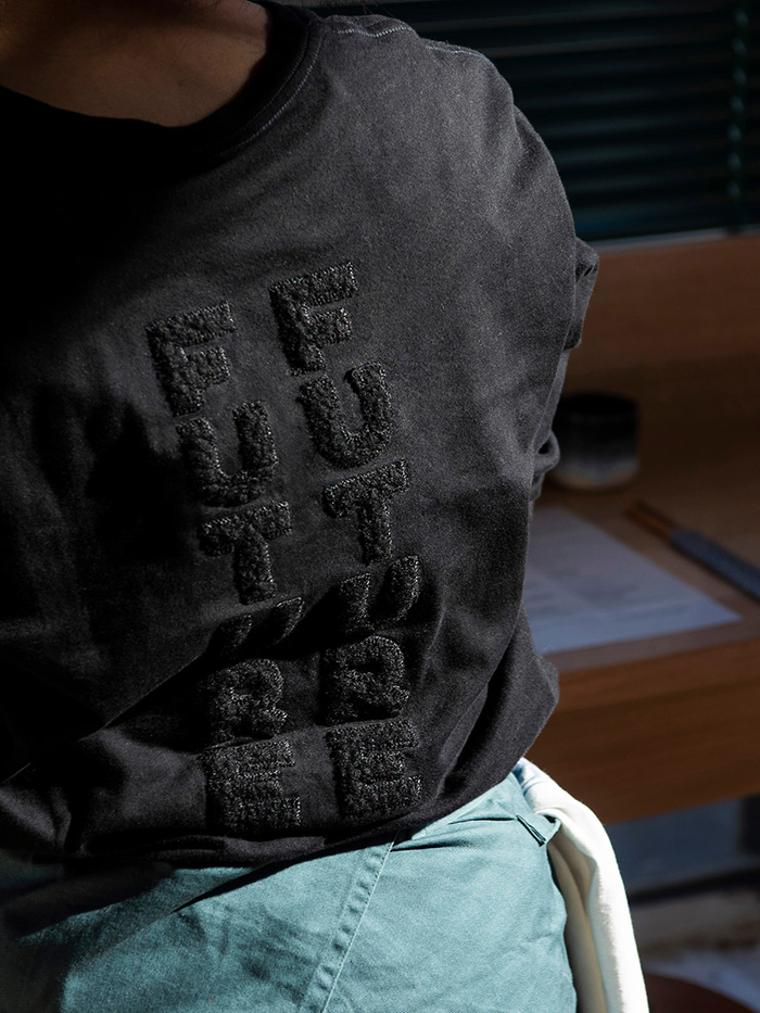
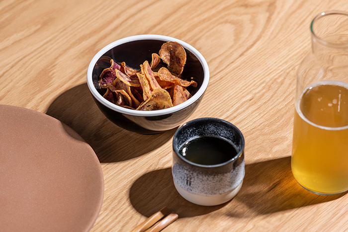
Future Future is a new eatery dedicated to serving bespoke yet accessible Japanese cuisine, filtered through an Australian consciousness. An old Richmond art gallery has been transformed into a refined and cool dining experience with unexpected quirks, an homage to Japanese street style and culture.
“明日之明日”是一家经营日本料理的新餐厅。这家餐厅可为顾客定制各种融合了澳洲特色、大众消费水平的美味佳肴。餐厅由古老的里士满艺术画廊改装而成,带给顾客精致、酷炫、意想不到用餐体验,我们对餐厅这种怪异之改装实则致敬日本街头文化。
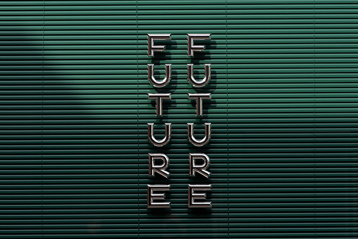
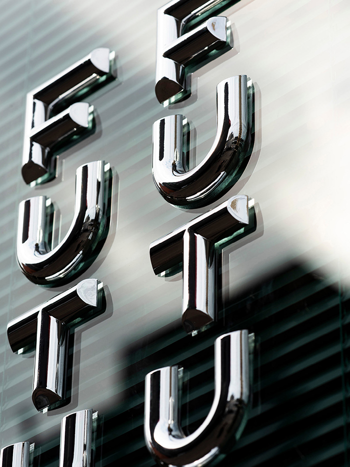
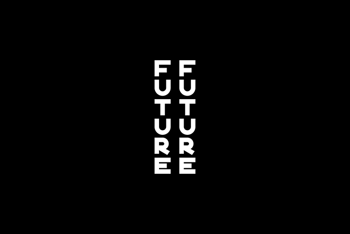
The verticality of the logotype reflects the orientation of Japanese script with the repetition of the word 'Future' in the name meaning that it can also be read backwards as per Japanese custom as well. The word ‘Future’ is also subtly woven into the custom-drawn pattern.
垂直、重复的标识“明日”反映了日本文字纵向从右往左、从上往下的书写习惯。“明日”这个词也巧妙地融入了为顾客特制美食,需时等待之意。
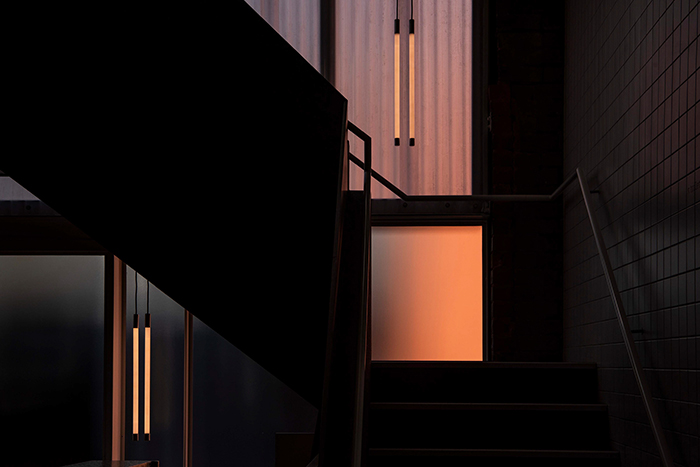
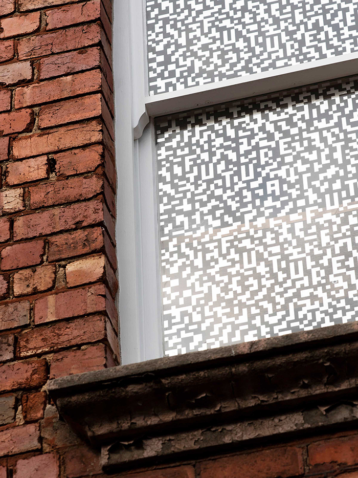
We worked closely with Olaver Architecture to develop innovative chrome-plated 3D printed lettering on the main front windows. The verticality of the logotype can be seen reflected throughout the space such as in the lighting.
我们与Olaver Architecture密切合作,在主前窗上创新地使用镀铬3D打印字体,可使垂直的标识的通过光影投射呈现出来。
The signage and contemporary architecture combine together with the old heritage facade to create a distinctly Japanese and Melbournian feel. The chrome patterned graphics on the windows serve two functions; to control the amount of light filtering into the space particularly in summer, and to create a subtle but interesting branding presence through shadows throughout the interiors.
垂直地标识、现代化地装修风格与古老建筑完美结合,营造出独特地日本和墨尔本风格。 窗户上镀铬图案的图形有两个功能; 其一,阻挡强烈的光线,特别是在夏天;其二,可通过整个光影的投射巧妙有趣地呈现出餐厅的品牌。
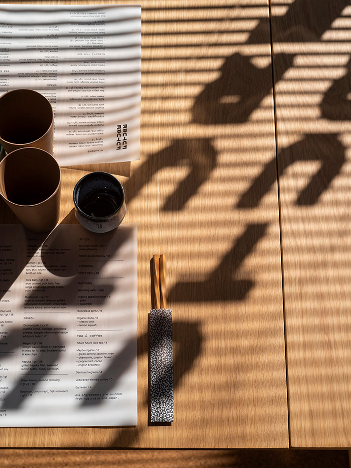
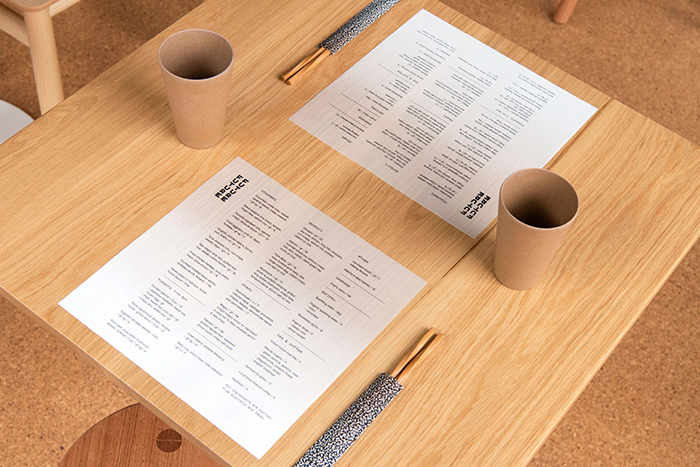
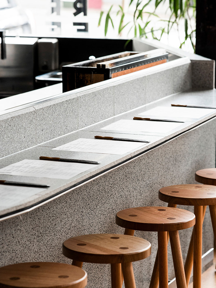
The menus were kept intentionally simple. The chopstick sleeves and placemat menus feature a white ink gradient on translucent stock; a contemporary twist on Japanese paper.
菜单刻意创作地简单而直观。筷子和菜单摆放在白色半透明的石桌上,巧妙地诠释出了日本的现代风格。
The website is moody and minimalist, featuring beautiful film photography from Tokyo to set a contemporary, street culture vibe.
Visit the site at futurefuture.com.au
餐厅网站色彩灰暗,内容极简,最大的特色是网页上有来自东京的特色电影,营造出现代的街头文化氛围。